Malofiej 23
Show, Don’t Tell! Workshop March 15-18 marzo 2015 Cumbre Mundial de Infografía Infographics World Summit March 18-20 marzo 2015
Gráficos en vena Graphics straight into the vein
SNDE / Universidad de Navarra Edificio Bibliotecas 31009 Pamplona (Spain) T +34 948 425 600 F +34 948 425 636 www.malofiejgraphics.com www.snd-e.com
Show, Don’t Tell! Workshop Cumbre Mundial de Infografía Infographics World Summit March 15-20 marzo 2015 Spain Pamplona, España
* La sangre tarda 23 segundos en circular por el cuerpo humano. * Blood takes 23 seconds to flow through the human body.
ORGANIZAN HOST
M23 Programa OK Ene15.indd 1
COLABORAN CONTRIBUTORS
05/02/15 11:25
Malofiej 23 Gráficos en vena Graphics straight into the vein
Programa provisional Temptative Program
Información actualizada en www.malofiejgraphics.com Check www.malofiejgraphics.com for updated information
23 Show, Don’t Tell! Workshop
23 Cumbre Mundial de Infografía Infographics World Summit
March 15-20 marzo 2015 Spain Pamplona, España
23 Show, Don’t Tell! Workshop Domingo 15 de marzo Sunday March 15 HOTEL AC CIUDAD DE PAMPLONA AC CIUDAD DE PAMPLONA HOTEL
19.30-20.00 20.00-20.15 20.15-21.00 21.00-22.30
Registro de participantes. Registration. Bienvenida. Welcome. Javier Errea. Presidente de la SND-E. SND-E president. Presentación inaugural. Instructores. Opening presentation. Instructors. John Grimwade, Alberto Cairo, Geoff McGhee. Cóctel inaugural. Opening Cocktail.
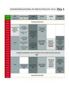
Lunes 16 de marzo Monday March 16 MUSEO UNIVERSIDAD DE NAVARRA MUSEUM UNIVERSITY OF NAVARRE
8.45
9.00-11.30 11.45-12.00 12.00-13.30 13.30-14.30 14.30-16.00
16.00-17.30 17.30-19.30
Salida del autobús desde el hotel AC Ciudad de Pamplona [Iturrama 21]. Bus departure from the AC Ciudad de Pamplona Hotel [Iturrama 21]. Ejercicio 1. Exercise 1. ‘Volkswagen Data’ Visita a las instalaciones de Volkswagen Navarra. Visit of the Volkswagen Navarra factory. Regreso del autobús a Museo Universidad de Navarra. Bus departure to Museum University of Navarre. Clase 1. Class 1. John Grimwade. Cómo mejorar tus gráficos. How to Improve Your Infographics. Almuerzo libre. Lunch on your own. Clase 2. Class 2. Alberto Cairo. Datos y Visualización: Exploración de análisis de datos y presentación de los gráficos. Data and Visualization: Exploratory Data Analysis and Graphic Presentation. Clase 3. Class 3. Geoff McGhee. La infografía y la evolución del arte en diseño interactivo. Infographics and the Evolving Art of Interaction Design. Ejercicio 1. Trabajo en equipo. Exercise 1. Teamwork.
Martes 17 de marzo Tuesday March 17
Adolfo Arranz
Manuel Cabrera
Feilding Cage
Alberto Cairo
Marcelo Duhalde
Martin Gamache
Adolfo Arranz es director creativo de MediaCorp (Singapur) donde desarrolla la infografia en el diario Today. Estudió Dibujo Publicitario. Trabajó como infografista para El Mundo (España) tanto en la edición nacional como en varias regionales. En 2011 se trasladó a Hong Kong para trabajar en el diario South China Morning Post como infografista senior. Sus trabajos han sido premiados a nivel internacional (WAN-IFRA Asia, SND, Malofiej). Es un activo ‘Urbansketcher’. Adolfo Arranz, Creative Director in MediaCorp (Singapore), is responsible for the graphics at the newspaper Today. He studied Advertising Drawing. Arranz has worked at El Mundo (Spain) for both the national edition as for several regionals as Graphics Artist. In 2011, he moved to Hong Kong for working in South China Morning Post as Senior Graphics Artist. His works have been awarded internationally (WAN-IFRA Asia, SND, Malofiej). He is an active ‘Urbansketcher’.
Coordinador de Arte en diario El Telégrafo, de Guayaquil (Ecuador), donde trabaja como infografista desde 2010. Su interés por los gráficos comenzó a los 9 años de edad, cuando acompañaba a su hermano mayor al diario Expreso de Guayaquil, donde más adelante también él trabajó durante once años. Estudió Diseño Gráfico y Publicitario en la Escuela Superior Politécnica del Litoral. Desde 2012 su trabajo ha sido reconocido con varios Awards of Excellence de la SND y medallas de oro y bronce en Malofiej. Manuel Cabrera coordinates the Art Department in the newspaper El Telégrafo in Guayaquil (Ecuador), where he began working as a Graphics Artist in 2010. His interest in graphics began when he was nine years old and he would accompany his older brother to his job at the newspaper Expreso, in Guayaquil. Cabrera also worked in that same newspaper for eleven years. He studied Design and Visual Communication at ESPOL (Escuela Superior Politéctica del Litoral). Since 2012 his work has been recognized with various SND Awards of Excellence and gold and bronze medals at Malofiej Awards.
Editor de proyectos especiales para Guardian Visuals (Londres). Durante los últimos tres años, Feilding ha producido contenido visual e interactivo para las principales noticias publicadas por The Guardian, los archivos secretos de la Agencia de Seguridad Nacional, las elecciones en Estados Unidos y los derechos de los homosexuales, entre otros. Anteriormente, dirigió proyectos interactivos en Associated Press y la revista Time. Graduado en Periodismo por la University of North Carolina en Chapel Hill y Máster en Gestión de Comunciación Gráfica por la New York University. Su trabajo ha sido reconocido por los premios Emmy, el Premio Pulitzer, World Press Photo y Malofiej. Feilding Cage is a London-based special projects editor for Guardian Visuals. Over the past three years, Feilding has produced visual and interactive content for some of The Guardian’s top stories including the NSA files, US elections and gay rights. Previously, he led interactive projects at the Associated Press and Time magazine. Feilding graduated from the School of Journalism at UNC-Chapel Hill and completed a master’s degree in graphic communication management from NYU. His work has been recognized by the Emmy awards, the Pulitzer Prize for public service, World Press Photo and Malofiej.
En verano de 2015, Alberto Cairo será director de la Cátedra en Periodismo Visual de la University of Miami. Ha sido director del programa de Visualización en UM’s Center for Computational Science. Fue director de Infografía en elmundo.es (España) y en las revistas de la editora Globo (Brasil), ha impartido clases y ha trabajado como consultor en más de 20 países. También ha sido profesor en la University of North Carolina en Chapel Hill, y es autor del libro ‘El Arte Funcional: Infografía y visualización de la información’. Está trabajando en un nuevo libro titulado ‘The Truthful Art’, que será publicado en 2016. Starting in the summer of 2015, Alberto Cairo will be the Knight Chair in Visual Journalism at the University of Miami. He is also the director of the Visualization program at UM’s Center for Computational Science. Cairo has been Director of Infographics at elmundo.es (Spain) and Globo magazines (Brazil) and has taught and do consulting work in more than 20 countries. He has been the James H. Shumaker professor at the University of North Carolina-Chapel Hill, and the author of the book ‘The Functional Art: An Introduction to Information Graphics and Visualization.’ He is working on a new book, to be published in 2016, titled ‘The Truthful Art.’
Editor adjunto de Infografía de los periódicos Times of Oman (en inglés) y Al Shabiba (en árabe) en Omán desde 2013, donde ya trabajó antes como infografista para la empresa Muscat Media House. Desde 1996 ha trabajado en diversos diarios (La Tercera, El Metropolitano, El Mercurio de Chile y El Nuevo Día de Puerto Rico) y desde 2011 desarrolla gráficos, visualizaciones e ilustraciones desde su propia agencia. Ha sido profesor de Periodismo Visual en la Universidad Católica de Chile. Por su trabajo ha recibido premios Malofiej, SND, WANIFRA (Asian Media Awards) y de la Sociedad Interamericana de Prensa. Graphics Assistant Editor in the newspapers Times of Oman (in English) and Al Shabiba (in Arabic) in Oman since 2013, where he previously worked as a graphics artist for Muscat Media House. Since 1996 he has worked in various newspapers (La Tercera, El Metropolitano, El Mercurio in Chile,and El Nuevo Día in Puerto Rico) and since 2011 he has developed graphics, data visualization and illustrations from his own company. He has been a professor of Visual Journalism at Universidad Católica de Chile. His work has received awards from Malofiej, SND, WANIFRA (Asian Media Awards) and the Inter American Press Association.
Martin Gamache trabaja en National Geographic desde 2007, actualmente como editor senior de Mapas. Además es director y fundador de The Alpine Mapping Guild desde 1999. Trabajó en The American Alpine Journal, Boston Redevelopment Authority y Tele Atlas North America. Ha impartido clases en las universidades Northern British Columbia, Boston y Ottawa. Cuenta con diversos premios Malofiej, SND, CAGIS, entre otros. Martin Gamache is Senior Editor Maps of National Geographic, where he works since 2007. He’s also principal and founder of The Alpine Mapping Guild since 1999. He has worked in The American Alpine Journal, Boston Redevelopment Suthority and Tele Atlas North America. He has also worked as professor for Northern British Columbia, Boston and Ottawa Universities. His work has been awarded in Malofiej, SND, CAGIS…
John Grimwade
Randy Krum
Eleanor Lutz
Allison McCann
Geoff McGhee
Katherine McLean
Dirige su propio negocio de gráficos (johngrimwade.com). Trabajó 14 años en periódicos ingleses (seis de ellos como jefe de Infografía en The Times). Ha hecho gráficos para unas 40 revistas, varios libros y clientes corporativos. Ha sido director de Infografía de las revistas Condé Nast Traveler y Condé Nast Portfolio y consultor de gráficos para Popular Science. Actualmente es consultor de Infografía para Eight by Eight, una nueva revista de fútbol que hace énfasis en el diseño y la ilustración. Enseña Infografía en la School of Visual Arts en Manhattan y ha dado charlas en varios países. He has his own infographics business (johngrimwade.com), based in New York. Before moving to the U.S., he worked for 14 years on newspapers (including six years as Head of Graphics on The Times). Grimwade has produced infographics for over 40 magazines, several books, and corporate clients. He has been graphics director of Condé Nast Traveler and Condé Nast Portfolio magazines, and graphics consultant to Popular Science. He is currently consulting graphics director for Eight by Eight, a new football magazine that has an emphasis on design and illustration. He teaches infographics to undergraduates at the School of Visual Arts in Manhattan, and has made presentations in many countries.
Randy Krum es infografista, diseñador de visualizaciones de datos y presidente de InfoNewt (infonewt.com), empresa de visualización de datos e infografía que fundó en 2009. Es autor del libro ‘Cool Infographics: Effective Communication with Data Visualization and Design’, publicado en 2013, y de la conocida web, Cool Infographics (coolinfographics.com). Randy imparte conferencias en universidades, empresas y agencias gubernamentales sobre infografía, los métodos de la visualización de datos, la comercialización del contenido visual y el uso eficaz de la información visual. Randy Krum is an infographics and data visualization designer, and is President of InfoNewt (infonewt.com), the data visualization and infographics design company he founded in 2009. He is the author of the book ‘Cool Infographics: Effective Communication with Data Visualization and Design’ published in 2013 and the popular infographics website, Cool Infographics (coolinfographics.com). Randy speaks at conferences, universities, corporate events, and government agencies about infographics design, data visualization methods, visual content marketing, and the effective use of visual information.
Diseñadora freelance desde julio de 2014. Ha trabajado para clientes como National Geographic, The World Book Encyclopedia, The Huffington Post, Adobe, Threadless y Visually, entre otros. Desde marzo de 2011 a junio de 2014 colaboró como estudiante investigadora con el laboratorio del Dr. Jeff Riffell en la University of Washington, donde estudió Biología Molecular. Su trabajo ha sido incluido en ‘The 18 Best Infographics of 2014’ por Fast Company. También ha sido publicado en The Washington Post, Wired, Gizmodo, Colossal, Buzzfeed, PopSci, International Business Times, entre otros. Autora del blog Tabletop Whale. Full-time freelance designer, since July, 2014. Clients include National Geographic, The World Book Encyclopedia, The Huffington Post, Adobe, Threadless, and Visually. From March 2011 to June 2014, she has been a student researcher in Dr. Jeff Riffell’s lab at the University of Washington. B.S. Cellular, Molecular, & Developmental Biology with departmental Honors and a Chemistry Minor. Her work has featured in ‘The 18 Best Infographics of 2014’ by Fast Company. Also featured in articles at The Washington Post, Wired, Gizmodo, Colossal, Buzzfeed, PopSci, International Business Times... She writes the blog Tabletop Whale.
Allison McCann es periodista visual para FiveThirtyEight, la web de noticias de datos fundada por Nate Silver. McCann analiza los datos, diseña y desarrolla gráficos, alejados de las habituales líneas y barras usadas para comunicar la información visual, explorando nuevas e interesantes formas. Su trabajo fue seleccionado para los ‘Best American Infographics 2015’. Anteriormente, trabajó en el departamento de Infografía de la revista Bloomberg Businessweek, que fue elegido Estudio de Diseño del Año por ‘Creative Review’ en 2013. Allison McCann is a visual journalist at FiveThirtyEight, the data news site started by Nate Silver. She analyzes data, designs and develops graphics, straying from the usual lines and bars to communicate visual information using new and interesting forms. Her work was selected for the ‘Best American Infographics 2015’. Prior to FiveThirtyEight she worked on the graphics desk at Bloomberg Businessweek, which was named Design Studio of the Year by ‘Creative Review’ in 2013.
Geoff McGhee desarrolla medios interactivos para el periodismo y la docencia, dentro de un proyecto de un centro de investigación en la Universidad de Stanford. Ha trabajado en The New York Times, Le Monde (Francia) y ABC News como editor de Infografía, productor multimedia y reportero de vídeo. En 2010 se le concedió una beca John S. Knight de Periodismo en Stanford, y produjo un documental muy conocido sobre infografía y visualización de datos, titulado ‘Journalism in the Age of Data’. Nacido en Nueva York, recibió un Máster en Periodismo por la Universidad de Columbia. Geoff McGhee develops interactive media for journalism, teaching, and scholarship at a research center at Stanford University. He has worked at The New York Times, Le Monde (France), and ABC News as an infographics editor, multimedia producer, and video journalist. As a John S. Knight Journalism Fellow at Stanford in 2010, he produced a widely cited documentary on data visualization and infographics, ‘Journalism in the Age of Data.’ A native New Yorker, he received his master’s in journalism at Columbia University.
Diseñadora, cartógrafa y coleccionista de olores urbanos para la comunicación visual / olfativa. Investiga la percepción del entorno urbano a través del olfato, de ‘datos de olores’. Su trabajo artístico combina el ‘smellwalking’, diseño digital, acuarela, gráficos en movimiento y la etnografía para la creación de mapas sensoriales. Su trabajo reciente ha sido expuesto en Edimburgo, Glasgow, Ámsterdam, Newport, París y Pamplona. Su serie de mapas sensoriales escoceses forma parte de la colección de la National Library of Scotland. En 2014 fue galardonada con el Avenza Award por su mapa digital ‘Aromas de Ámsterdam’. Profesora de Diseño Gráfico en CCCU y estudiante de Doctorado en el Royal College of Art de Londres. Designer, mapper and collector of urban smells working in visual / olfactory communication. Her research links human perception of ‘smell data’ with the urban environment through sensory mappings. She combines smellwalking, digital design, watercolour, motion graphics, distillation and scent diffusion in the creation of smellmap installations. Her novel work has been exhibited in Edinburgh, Glasgow, Amsterdam, Newport, Paris and Pamplona. Her Scottish sensory map series is held in the National Library of Scotland’s permanent collection, and in 2014 she was awarded the Avenza Award for digital mapping for a motion graphic of the Scents of Amsterdam. She works as a Senior Lecturer of Graphic Design at CCCU and is a part-time PhD candidate, Information Experience Design at the RCA, London.
Sandra Rendgen
Alissa Scheller
Mónica Serrano
Matthew Swift
Richard Saul Wurman
Karen Yourish
Sandra Rendgen es escritora y editora con un enfoque particular en la infografía, los medios interactivos y la historia de la visualización de la información. En colaboración con la editorial Taschen, lanzó ‘Information Graphics’ en 2012 y, más recientemente, ‘Understanding the World’ (2014). Con formación académica en historia del arte y teoría cultural, Rendgen está ampliando su investigación en la historia de la infografía. Sandra Rendgen is an author and editor with a particular focus on infographics, interactive media and the history of information visualisation. In collaboration with Taschen Publishing, she released ‘Information Graphics’ (2012) and ‘Understanding the World’ (2014). With an academical background in art history and cultural theory, she is currently expanding her research in the history of Infographics.
Alissa Scheller es una de las dos personas que forman el equipo de Infografía en The Huffington Post. Scheller realiza todo tipo de mapas, gráficos e ilustraciones en una amplio abanico de temas, como religión, medio ambiente, política y salud, entre otros. Anteriormente, trabajó en un think tank político en Washington, D.C., como diseñadora gráfica, se encargaba de la maquetación y la infografía. Estudió Periodismo, Diseño Gráfico e Historia del Arte en la American University en Washington, D.C. Alissa Scheller is half of the twoperson infographics team at The Huffington Post. She makes all manner of maps, charts and illustrations on a wide range of topics, including religion, the environment, politics, and health. She previously worked at a Washington, D.C. political think tank as a graphic designer, creating page layouts and infographics. She studied journalism, graphic design, and art history at American University in Washington, D.C.
Infografista e ilustradora, ha trabajado para Corriere della Sera (Italia), Courrier International (Francia) o El País (España). Anteriormente formó parte de los departamentos de Infografía de los diarios españoles Público y Diario de Cádiz. Ha impartido clase en el Istituto Europeo di Design (IED), y su obra mas reciente formo parte de la muestra ‘Mappe del sapere’, en la Triennale de Milán durante diciembre de 2014. Mónica Serrano is an Illustrator and Graphics Artist. Corriere della Sera (Italy), Courrier International (France) and El País (Spain) are included among her clients. She worked as a member of Público (Spain) and Diario de Cádiz’s Graphics Departments. She has also worked as a teacher for the Istituto Europeo di Design (IED), and her most recient work is included in ‘Mappe del sapere’ exhibition, that took place in Milan in December 2014.
Editor de Infografía en The Times de Londres desde 2010, ha trabajado en periódicos británicos durante 16 años. Después de graduarse en Diseño de Comunicación Visual en la Middlesex University, contribuyó con ilustraciones y gráficos para libros, revistas y exposiciones. Comenzó su carrera en periodismo como ilustrador freelance hasta que dio el salto a la infografía en 1999. Primero en el diario The Express, de la mano de John Lawson, después en The Sunday Times y, más tarde, en The Times, con Geoffrey Sims. Estuvo involucrado en el lanzamiento de la galardonada revista de vida y ciencia, Eureka. Siempre trata de descubrir la clave de las historias e interpretar la información para hacerla más comprensible para el lector. Graphics Editor at The Times of London since 2010 and has been working in British newspapers for 16 years. After graduating in Visual Communication Design at Middlesex University he has contributed illustrations and graphics to books, magazines and exhibitions. He began his newspaper career as a freelance illustrator until switching to newspaper graphics in 1999. Starting at The Express newspaper, under John Lawson, moving onto The Sunday Times and then to The Times under Geoffrey Sims. He was involved in the launch of the award winning life and science magazine, Eureka. In his work his goal is to get to the crux of the story and interpret the information into something more understandable for the reader.
A Richard Saul Wurman le apasiona hacer que la información sea comprensible. Guiado por su curiosidad, Wurman ha resultado galardonado como autor, arquitecto, cartógrafo, profesor, diseñador urbano, arquitecto y teórico de la información. Ha creado y presidido las conferencias TED (Tecnología, Entretenimiento, Diseño) desde 1984 hasta 2002. Ha recibido el Premio a la Trayectoria en el Diseño del Museo Nacional de Diseño Smithsonian y fue galardonado con el 50 Premio Washburn Bradford Annual del Museo de las Ciencias de Boston. Entre sus proyectos más recientes, destaca el Observatorio Urbano, una iniciativa centrada en la cartografía comparativa, y el libro ‘Worship the God of Understanding’. Richard Saul Wurman, FAIA is passionate about making information understandable. Guided by his curiosity, Wurman has had many lives as an award winning author, architect, cartographer, teacher, urban designer, information architect, and information theorist. Wurman created and chaired the TED (Technology, Entertainment, Design) conferences from 1984 thru 2002. He is the recipient of the Lifetime Achievement Award in design from the Smithsonian National Design Museum and was awarded Boston Science Museum’s 50th Annual Bradford Washburn Award. His most recent projects are the Urban Observatory, an initiative focused upon comparative cartography, and a major book titled ‘Worship the God of Understanding’.
Karen Yourish es Editora de Infografía de The New York Times desde 2013, después de más de una década en The Washington Post y la revista Newsweek. Su documentación, que comprende desde noticias de actualidad hasta investigación, nutre a los gráficos con inmediatez y fuerza narrativa. Yourish estudió un máster (M.S.) en Periodismo en la Columbia University. Su trabajo ha sido reconocido por numerosos premios de la SND y Malofiej, entre los que destaca el Premio Peter Sullivan ‘Best of Show’ en 2014. Karen Yourish is a Graphics Editor at The New York Times. She joined the paper in 2013 after more than a decade at The Washington Post and Newsweek magazine. Her reporting, from spot news to investigations, fuels graphics with immediacy and explanatory power. She estudied at Columbia University, Graduate School of Journalism M.S. Her work has been recognized by numerous awards from SND and Malofiej, including the 2014 Peter Sullivan Award ‘Best of Show.’
MUSEO UNIVERSIDAD DE NAVARRA MUSEUM UNIVERSITY OF NAVARRE
14.30-19.00
Ejercicio 1. Trabajo en equipo. Exercise 1. Teamwork. Almuerzo libre. Lunch on your own. Ejercicio 1. Trabajo en equipo. Exercise 1. Teamwork.
19.00-19.30
Ejercicio 2. Exercise 2. ‘Personal symbol’ Guía para el proyecto personal. Guidelines for the personal symbol.
9.00-13.30 13.30-14.30
Miércoles 18 de marzo Wednesday March 18 MUSEO UNIVERSIDAD DE NAVARRA MUSEUM UNIVERSITY OF NAVARRE
9.00-10.30 10.30-12.00 12.00-13.00 13.00-13.15
Ejercicio 1. Presentación y crítica de los instructores. Exercise 1. Presentation and critique by the instructors. Ejercicio 2. Trabajo individual. Exercise 2. Individual work. Ejercicio 2. Presentación del proyecto personal. Exercise 2. Presentation of the personal project. Entrega de diplomas y clausura. Diplomas and closing.
23 Cumbre Mundial de Infografía Infographics World Summit Miércoles 18 de marzo Wednesday March 18 MUSEO UNIVERSIDAD DE NAVARRA MUSEUM UNIVERSITY OF NAVARRE
19.00-20.00
Registro de participantes. Registration.
20.00-20.30 Bienvenida y apertura. Welcome and opening.
Javier Errea, presidente de la SND-E. SND-E president. Mónica Herrero, decana de la Facultad de Comunicación de la Universidad de Navarra. Dean of the School of Communication. University of Navarre. 20.30-22.00 Cóctel de bienvenida. Opening Cocktail.
Jueves 19 de marzo Thursday March 19 FACULTAD DE COMUNICACIÓN. UNIVERSIDAD DE NAVARRA SCHOOL OF COMMUNICATION
9.15-10.00 10.00-10.45 10.45-11.15 11.15-12.00 12.00-12.45 12.45-14.00 14.00-16.15 16.15-17.00 17.00-17.45 17.45-18.15 18.15-19.00
Marcelo Duhalde. Después de la inspiración. After the spark. Adolfo Arranz. Dibujando infografías. Sketching infographics. Café. Coffee break. Matthew Swift. La vida después del muro de pago. Life behind the paywall. Karen Yourish. Visualización de noticias. Visualizing the News. Conversación con Richard Saul Wurman. A talk with Richard Saul Wurman. Almuerzo libre. Lunch on your own. Manuel Cabrera. Infografía desde cero. En sus marcas, listos… ¡fuera!. Graphics from scratch. Ready, set, go! Alissa Scheller. Infografía y Redes Sociales. Infographics and Social Media. Café. Coffee break. Sandra Rendgen. Cartografía de flujo. Los cincuenta mapas de Minard. A Cartography of Flux—The Fifty Maps of Minard.
Viernes 20 de marzo Friday March 20 FACULTAD DE COMUNICACIÓN. UNIVERSIDAD DE NAVARRA SCHOOL OF COMMUNICATION
9.15-10.00 10.00-10.45 10.45-11.15 11.15-12.00 12.00-12.45 12.45-13.30 13.30-16.00 16.00-16.45 16.45-17.30
17.30-18.00 18.00-19.00
21.00 21.30
Mónica Serrano. Del deber y la belleza. Of duty and beauty. Eleanor Lutz. Infografía animada para la Era Digital. Animated infographics for the digital age. Café. Coffee break. Feilding Cage. Empezar a comer por el postre. Eat Dessert First. Martin Gamache. Por qué son especiales. Why they are special. Randy Krum. Los siete pecados capitales de la Infografía. The Seven Deadly Sins of Infographics Design. Almuerzo libre. Lunch on your own. Allison McCann. Contra los gráficos aburridos. Against Boring Charts. Katherine McLean. Efímero C’Art: discontinuos, temporales y discutidos paisajes de los olores. Ephemeral C’Art: Discontinuous, temporal & contested smellscapes. Café. Coffee break. Presentación de las medallas de oro del certamen Malofiej 23. Malofiej 23 Gold Awards presentation. Salida del autobús desde el hotel AC Ciudad de Pamplona [Iturrama 21]. Bus departure from the AC Ciudad de Pamplona Hotel [Iturrama 21]. Cena de clausura y entrega de premios. Closing gala and awards dinner. Restaurante Castillo de Gorraiz. Castillo de Gorraiz Restaurant.
Localizaciones Locations
Instructores SDT SDT Instructors
Facultad de Comunicación Universidad de Navarra School of Communication University of Navarre Campus Universitario [31009] www.unav.edu/fcom/
John Grimwade johngrimwade.com, USA INSTRUCTOR
Museo Universidad de Navarra Museum University of Navarre Campus Universitario [31009] museo.unav.edu/en/
Geoff McGhee Stanford University, USA PROFESSOR Alberto Cairo University of Miami, USA PROFESSOR
Hotel AC Ciudad de Pamplona AC Ciudad de Pamplona Hotel Iturrama 21, Pamplona [31007] www.ac-hotels.com Restaurante Castillo de Gorraiz Castillo de Gorraiz Restaurant Avda. Egües 78 Gorraiz, Navarra [31620] www.cgrestaurante.es
M23 Programa OK Ene15.indd 2
#Malofiej23 @malofiej facebook.com/malofiej
05/02/15 11:25